
 Français
 Italiano
Hinweis: Leere nach dem Veröffentlichen den Browser-Cache, um die Änderungen sehen zu können.
- Firefox/Safari: Umschalttaste drücken und gleichzeitig Aktualisieren anklicken oder entweder Strg+F5 oder Strg+R (⌘+R auf dem Mac) drücken
- Google Chrome: Umschalttaste+Strg+R (⌘+Umschalttaste+R auf dem Mac) drücken
- Edge: Strg+F5 drücken oder Strg drücken und gleichzeitig Aktualisieren anklicken
/* Marker tooltip styles Version: 2024-09-15 */ /* Styles for tooltip box */ .voy-mkTooltip { position: absolute; background: transparent; color: #000; font-weight: normal; font-size: 90%; font-style: normal; line-height: 1.25em; text-align: left; z-index: 10; /* markers: z-index: 2; wikiEditor-ui-toolbar: z-index: 7 */ cursor: auto; } @media screen { html.skin-theme-clientpref-night .voy-mkTooltip { color: #fff; } } @media screen and (prefers-color-scheme: dark) { html.skin-theme-clientpref-os .voy-mkTooltip { color: #fff; } } .voy-mkTooltipMobile { line-height: 1.5em; } .voy-mkTooltipInner { position: relative; background-color: ivory; border: 1px solid #808080; border-left-width: 4px; border-radius: 3px; box-shadow: 0 0 2px 1px rgba(0,0,0,0.5); padding: 2px 4px; } @media screen { html.skin-theme-clientpref-night .voy-mkTooltipInner { background-color: #333; } } @media screen and (prefers-color-scheme: dark) { html.skin-theme-clientpref-os .voy-mkTooltipInner { background-color: #333; } } .voy-mkTooltipInner div, .voy-mkTooltipInner table { white-space: nowrap; } .voy-mkTooltipInner table { width: 100% !important; /* !important for Minerva Skin */ display: table !important; margin: 0 !important; border-collapse: collapse; border-spacing: 0; border-style: none; } .voy-mkTooltipInner table td { padding: 0; text-align: left; border-style: none; } .voy-mkTooltipInner table td:last-child { padding-left: 2em; text-align: right; font-size: 80%; } .voy-mkTooltipInner button { border: none; background: transparent; font-family: sans-serif; font-size: 1em; cursor: pointer; padding: 0; color: #0645ad; } .voy-mkTooltipInner button:hover, .voy-mkTooltipInner button:focus, .voy-mkTooltipInner button:active { text-decoration: underline; } .voy-mkTooltipInner #infobutton button:before { content: 'ℹ'; font-family: serif; color: #000 !important; font-size: 130%; padding-left: 1px; padding-right: 3px; } @media screen { html.skin-theme-clientpref-night .voy-mkTooltipInner #infobutton button:before { color: #fff !important; } } @media screen and (prefers-color-scheme: dark) { html.skin-theme-clientpref-os .voy-mkTooltipInner #infobutton button:before { color: #fff !important; } } .voy-mkTooltipInner #editbutton button { position: relative; padding-left: 15px; } .voy-mkTooltipInner #editbutton button:before { content: " "; display: block; position: absolute; left: 0; top: 0; height: 100%; width: 15px; background-image: url( "//upload.wikimedia.org/wikipedia/commons/thumb/8/8a/OOjs_UI_icon_edit-ltr.svg/48px-OOjs_UI_icon_edit-ltr.svg.png" ); background-repeat: no-repeat; background-position: 0 25%; background-size: 12px; } .voy-mkTooltipMaxWidth { max-width: 12.5em; width: -moz-max-content; width: -webkit-max-content; width: max-content; } @media screen { html.skin-theme-clientpref-night .voy-mkTooltipInner button { color: var(--color-progressive,#36c); } html.skin-theme-clientpref-night .voy-mkTooltipInner #editbutton button:before { background-image: url( "//upload.wikimedia.org/wikipedia/commons/thumb/0/00/OOjs_UI_icon_edit-ltr-invert.svg/48px-OOjs_UI_icon_edit-ltr-invert.svg.png" ); } } @media screen and (prefers-color-scheme: dark) { html.skin-theme-clientpref-os .voy-mkTooltipInner button { color: var(--color-progressive,#36c); } html.skin-theme-clientpref-os .voy-mkTooltipInner #editbutton button:before { background-image: url( "//upload.wikimedia.org/wikipedia/commons/thumb/0/00/OOjs_UI_icon_edit-ltr-invert.svg/48px-OOjs_UI_icon_edit-ltr-invert.svg.png" ); } } /* Plus code and other text styles */ .voy-mkTooltipHint { font-weight: bold; } .voy-mkTooltipPlusCode { color: #808080; } /* Styles for tooltip tail */ .voy-mkTooltipTail { background: transparent; width: 14px; height: 10px; position: absolute; overflow: hidden; } .voy-mkTooltipTail:before { background: ivory; border: 1px solid #808080; box-shadow: 0 0 2px 1px rgba(0,0,0,0.5); box-sizing: border-box; position: absolute; content:""; width: 10px; height: 10px; top: 0; left: 0; } @media screen { html.skin-theme-clientpref-night .voy-mkTooltipTail:before { background-color: #333; } } @media screen and (prefers-color-scheme: dark) { html.skin-theme-clientpref-os .voy-mkTooltipTail:before { background-color: #333; } } /* Position-dependent styles for tooltip box */ .voy-mkBelow { padding-top: 15px; } .voy-mkAbove { padding-bottom: 15px; } .voy-mkLeft .voy-mkTooltipTail { left: 5px; } .voy-mkRight .voy-mkTooltipTail { right: 5px; } .voy-mkAbove .voy-mkTooltipTail { bottom: -10px; } .voy-mkAbove .voy-mkTooltipTail:before { transform-origin: 0 0; transform: rotate(-45deg); } .voy-mkBelow .voy-mkTooltipTail { top: -10px; } .voy-mkBelow .voy-mkTooltipTail:before { transform-origin: 0 100%; transform: rotate(45deg); } /* Marker arrow extension for mobile devices */ .voy-mkTooltipButton { border-top-right-radius: 3px; border-bottom-right-radius: 3px; padding: 0 0.15em; background-color: #fff; color: #000; cursor: pointer; font-size: 90%; } @media print { .voy-mkTooltipButton { display: none; } } /* Show complete tooltip if positioned an image container */ div.thumbinner.with-vCard, div.thumbinner.with-Marker { overflow: visible; } Explore the world
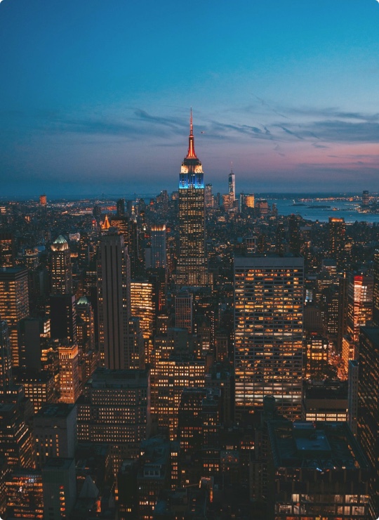
United states
New York
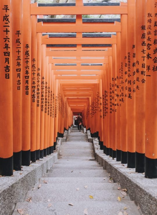
Japan
Tokyo
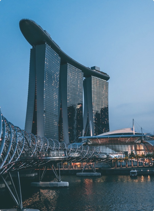
Singapore
Singapore